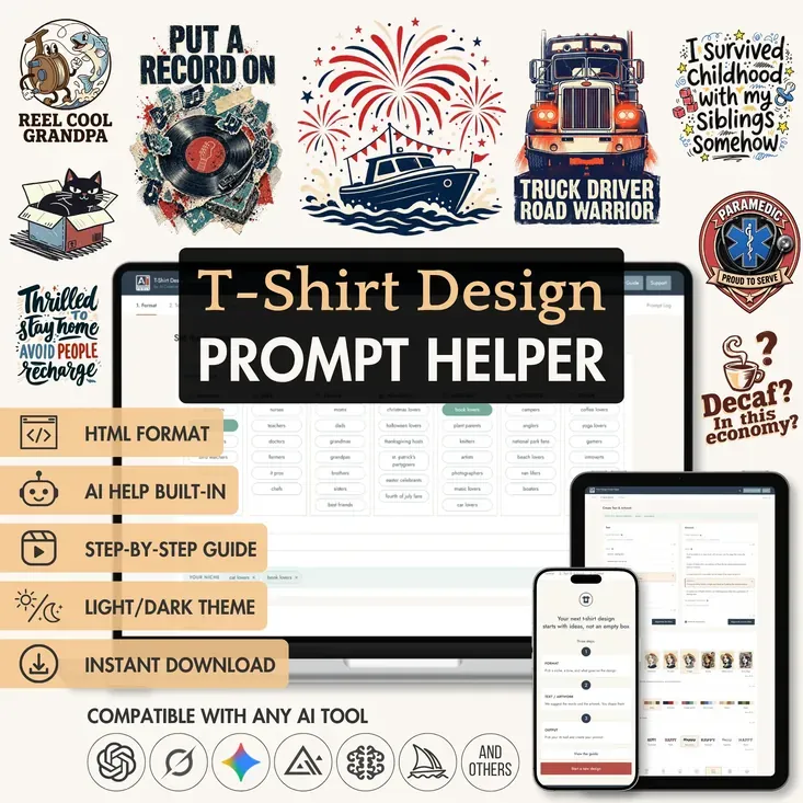
Heads up! This guide is for the new T-Shirt Design Prompt Helper. Own the older T-Shirt Design PRO Prompt Builder? You get the Helper for free: open the download instruction you already have and click the link inside. It opens your original builder, where you’ll find the link to the new download instruction.
Something not working? Write to us and we’ll send you the link directly.
Welcome, t-shirt sellers, print-on-demand shop owners, and everyone with a slogan they'd love to see on a shirt. Here we walk through the Prompt Helper step by step, share which AI generators we tested it with, and point out what turns a design into one people actually want to wear.
A Helper is like a Builder, but with a twist. A Builder only gives you the final prompt. The Helper creates together with you: it suggests ideas as you go and changes them the way you want.
Prefer to follow along on screen? The video version of this guide is on our YouTube channel:
Video version of this guide
Table of contents:
What you can create with the T-Shirt Helper
The Helper writes prompts for t-shirt designs - the print itself, ready for your AI tool to generate. Tell it who the shirt is for and what mood you're after, and it comes back with quote and artwork ideas to build on.
One niche never runs dry. The same group of people can get a punny quote today, a heartfelt one tomorrow, and a sarcastic one the day after. Each of those can become a bold typographic piece, a full illustration, or a mix of words and artwork.
The look is just as open: art styles from Vintage to Comic book, ready-made color palettes, and letterforms like Retro Groovy and Western. Each one can be used as it is, adjusted, or swapped for a description of your own.
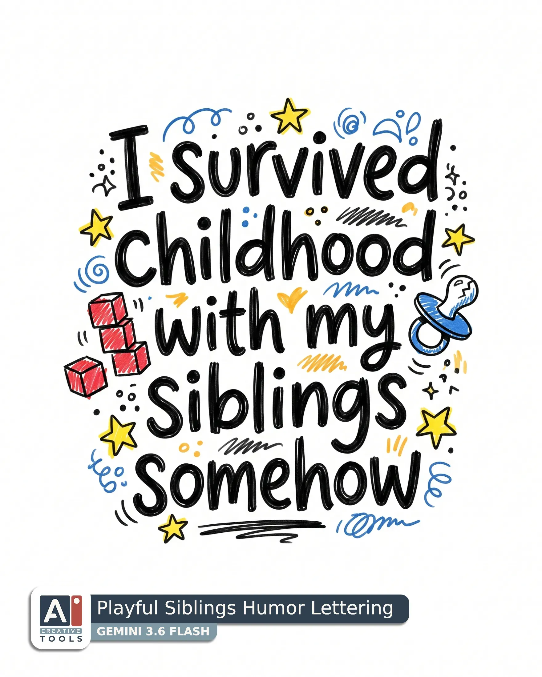
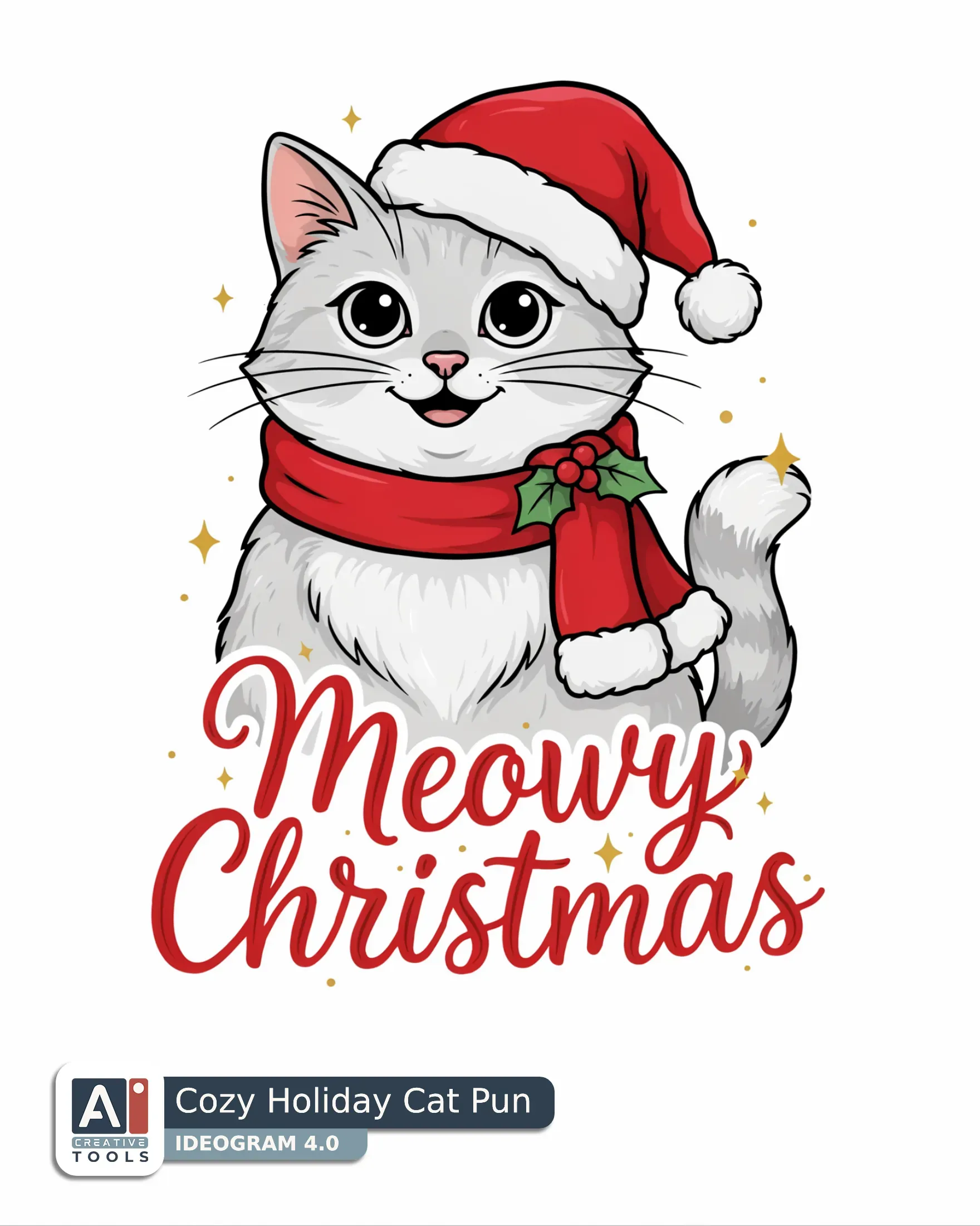
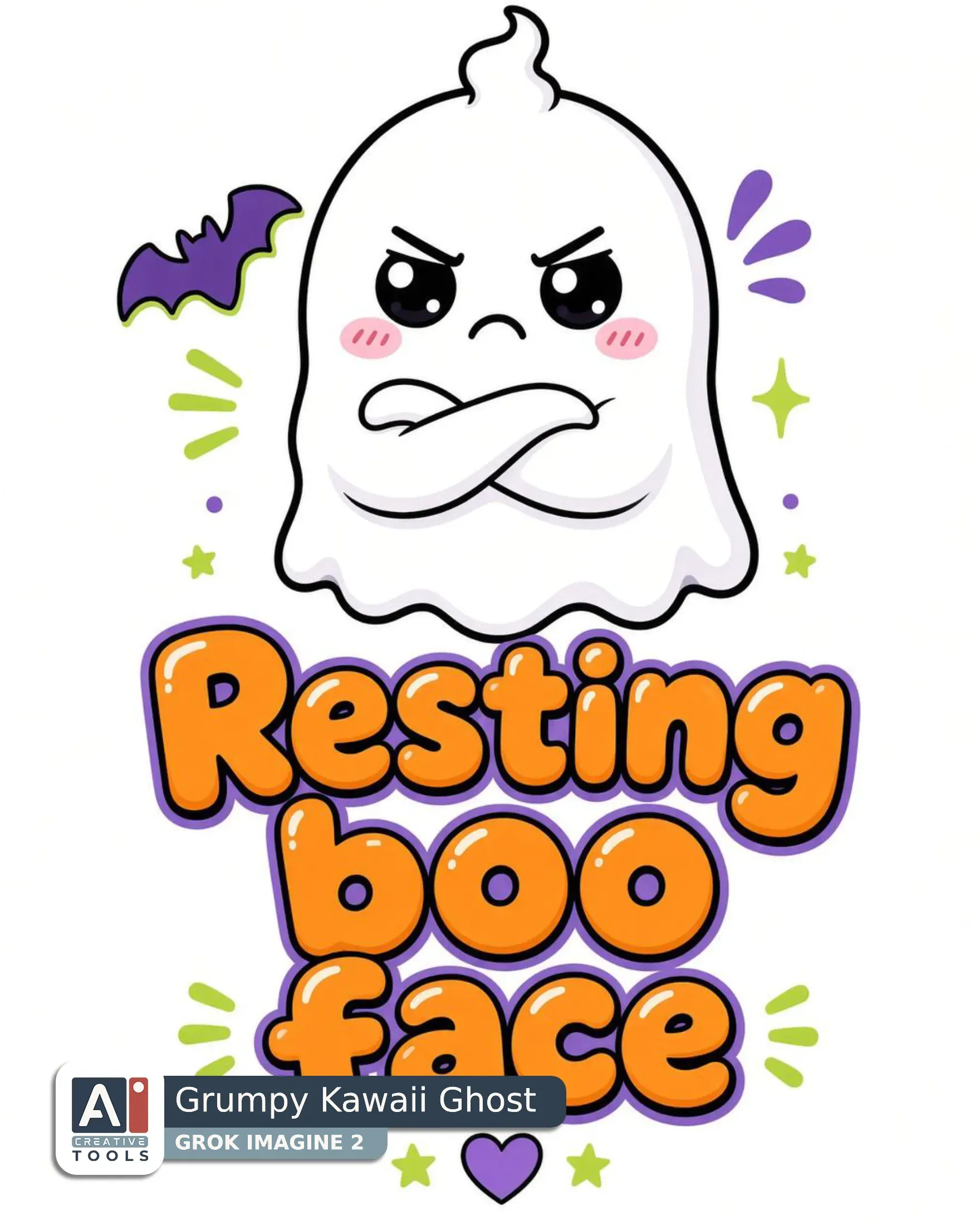
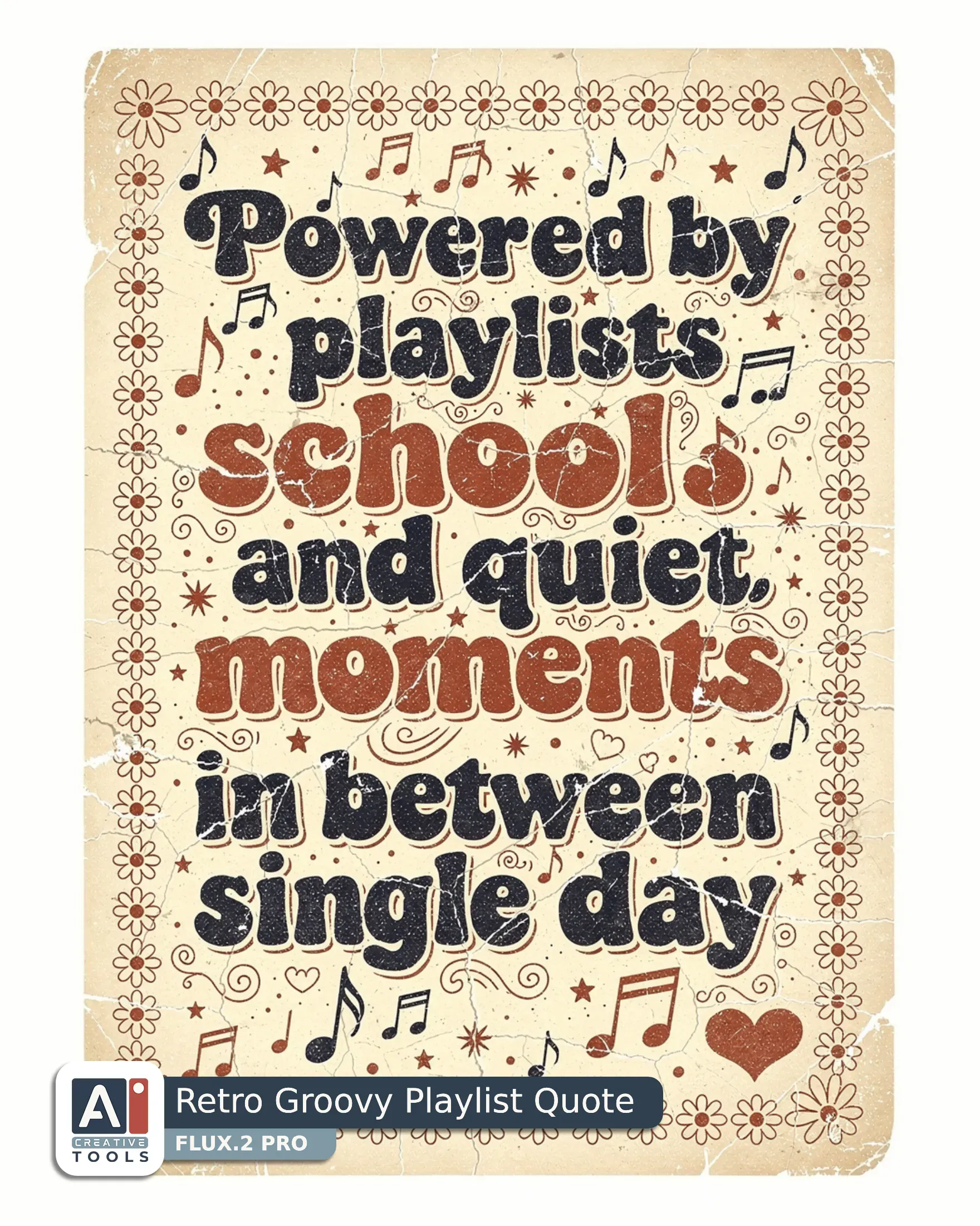
Here are some designs we made with the Helper. Open the block under the gallery to see the prompt behind each one.
Swipe to view more
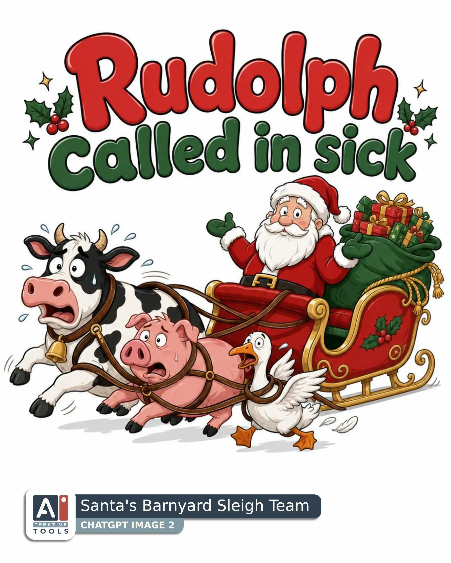
- Santa's Barnyard Sleigh Team (ChatGPT) Graphic design with the lettering "Rudolph called in sick" in bubbly, rounded letters across the top, large and evenly spaced, with the quoted words as the only lettering in the design. Below it sits a modern cartoon illustration, bold clean outlines, simple shapes, flat colours with soft shading, showing Santa's sleigh pulled by a flustered cow, a pig and a goose tangled in the reins, while Santa shrugs from the sleigh beside a sack of gifts. Keep the whole composition compact and readable, with the sleigh and animals forming one lively central cluster under the text. Use red, pine green, gold, and white throughout the subject and lettering, with red on Santa and the sleigh accents, pine green in the festive details, gold on the gifts and trim, and white highlights for contrast. Give the linework crisp weight, smooth cartoon curves, and gentle shaded depth without losing the flat graphic feel. Place the artwork fully inside the image on a solid white background with clear white space all around and plenty of white beneath the design.
- Playful Siblings Humor Lettering (Gemini) Create a typographic design with small decorative elements centered on the line "I survived childhood" and the next lines "with my siblings" and "somehow" so the wording reads at a glance in a handwritten style. Use a playful hand-drawn doodle, simple cartoon shapes, thick uneven marker lines, scribbled fills look, with the phrase stacked and surrounded by tiny matching doodles that echo the joke without crowding it. A few small toy blocks, a cracked pacifier, and scattered stars frame the words as one compact unit, with the stars tucked close around the lettering and the other pieces balanced around it like quick marker sketches. Keep the red, yellow, blue, black palette vivid and simple - red on the toy blocks, yellow in the stars and warm accents, blue in the remaining doodles, and black for the lettering, outlines, and rough shading. Give the letters a casual handwritten feel with clear spacing and bold strokes, and let the marker linework stay uneven and lively. Keep the whole composition floating on clean white with generous space around it and white beneath the lowest point so it sits comfortably inside the frame. Aspect ratio 4:5.
- Cozy Holiday Cat Pun (Ideogram) Graphic design and text with a cheerful cat in a Santa hat, paired with the phrase "Meowy Christmas" in bold hand-lettered script. The lettering sits tucked close beneath the cat and curves slightly with the pose, large, clear, and evenly spaced so it reads at a glance. The cat is the main focus, shown front-facing with bright eyes, a playful grin, soft whiskers, and a fluffy tail curled beside the body. Use a clean vector illustration style with smooth contours, crisp edges, and tidy shaded accents that keep the silhouette bold. Build the palette from Christmas red, Christmas green, white, black, and gold - red for the Santa hat and scarf trim, green for small holiday accents, white for fur highlights and hat fur, black for outline and facial details, and gold for tiny festive sparkles. The whole artwork is large and centered, filling about 85 to 90 percent of the image with a thin even border of white all around, including clear white space beneath the lowest point.
- Grumpy Kawaii Ghost (Grok) Graphic design and text with a grumpy little ghost with folded arms as the main subject, drawn in kawaii style, round chubby shapes, big shiny eyes, blush cheeks, soft thick outlines. The ghost sits centered in the upper part of the composition with a compact, bold silhouette and a pouty expression that gives it a festive Halloween mood. Below the artwork, the bubble lettering "Resting boo face" is the only lettering in the design, set large, clear, and evenly spaced so it reads at a glance. Keep the words in a friendly bubble letterform and place them directly under the ghost so the subject and text feel like one unit. Use pumpkin orange for the lettering accents, black for the ghost’s outline and facial features, purple for the main shadow and accent areas, and lime green for small pops of detail. The finish should feel crisp and playful with soft thick linework, simple shaded highlights, and clean flat fills. Set the whole design alone on a solid white background with generous white space all around and clear white space beneath the lowest point.
- Retro Groovy Playlist Quote (Flux) Typographic design with small decorative elements, a cozy tribute to everyday rhythm and favorite songs, built in vintage 1970s screen print, faded inks, misaligned print layers, worn cracked texture. "Powered by playlists," "school drop-offs," "and quiet moments" "in between every single day" sits in retro groovy lettering, stacked one above another with large, clear, evenly spaced words, centered in a tall block and surrounded by small matching doodles. A thin border of daisies and music notes frames the text closely, with a tiny heart tucked into one corner. Use navy for the main lettering and notes, red for the daisies and heart, and cream for highlights and softer fills. Keep the lines bold, slightly distressed, and softly weathered. The full design floats on solid white with generous white space below and around it.
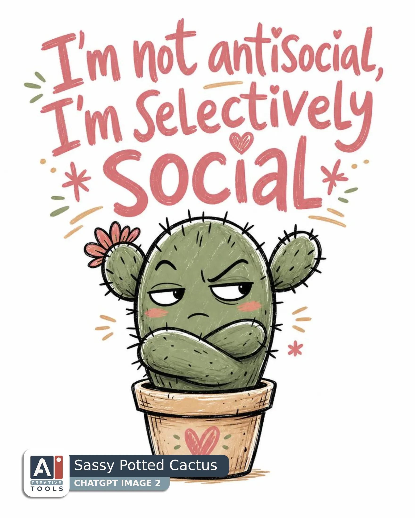
- Sassy Potted Cactus (ChatGPT) Create a graphic design with text of a small potted cactus with folded arms and a side-eye glance, paired with the line "I'm not antisocial," "I'm selectively" "social" set across the top in large handwritten letters, with the cactus below it as one compact focal shape. Use a playful hand-drawn doodle, simple cartoon shapes, thick uneven marker lines, scribbled fills that keep the attitude light and cheeky. Let the cactus feel compact and stubborn, with a tiny pot that anchors the pose and a glance that gives the whole piece its sarcastic edge. Color the design with desert pink in the lettering and warm accents, sand on the pot and highlights, clay in the cactus body and shadows, and sage green in the cactus pads and details. Keep the forms bold and readable, with lively sketchy outlines and rough texture that feels casual and improvised. The words should sit close above the artwork so they read with it as one design, cleanly spaced and easy to read at a glance. Leave the image centered on a plain white field with generous white space around it and clear white beneath the lowest point of the pot.
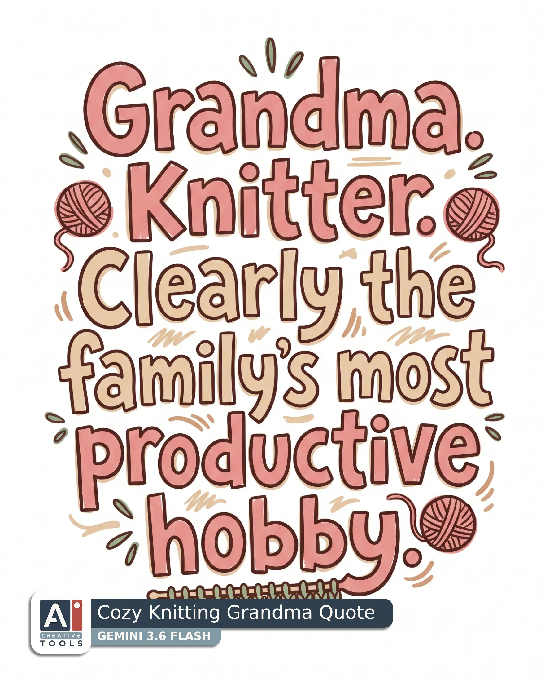
- Cozy Knitting Grandma Quote (Gemini) Create a typographic design with small decorative elements that celebrates a proud grandma knitter with a witty, self-assured energy. Use playful hand-drawn doodle, simple cartoon shapes, thick uneven marker lines, scribbled fills as the art style, with distressed lettering that feels handmade and lightly worn at the edges. Set the words "Grandma. Knitter. Clearly the family’s most productive hobby." in stacked lines, large, clear, and evenly spaced, with the text surrounded by small matching scattered doodles. Keep the words as the main focus, with tiny yarn balls flanking the text on both sides and a simple knitted edge beneath to anchor the composition. Shape the whole piece as one compact arrangement with bold, readable forms and a cheerful craft-room attitude. Use desert pink for the main lettering and the yarn balls, sand for the lighter fills and supporting marks, clay for the stronger outlines and accent details, and sage green for the small decorative touches and the knitted edge. Keep the linework loose and confident, with rough sketch texture and simple shaded fills that suggest marker ink on paper. The design sits alone on a solid white field with generous white space around every edge, and plenty of white below the lowest point. Aspect ratio 4:5.
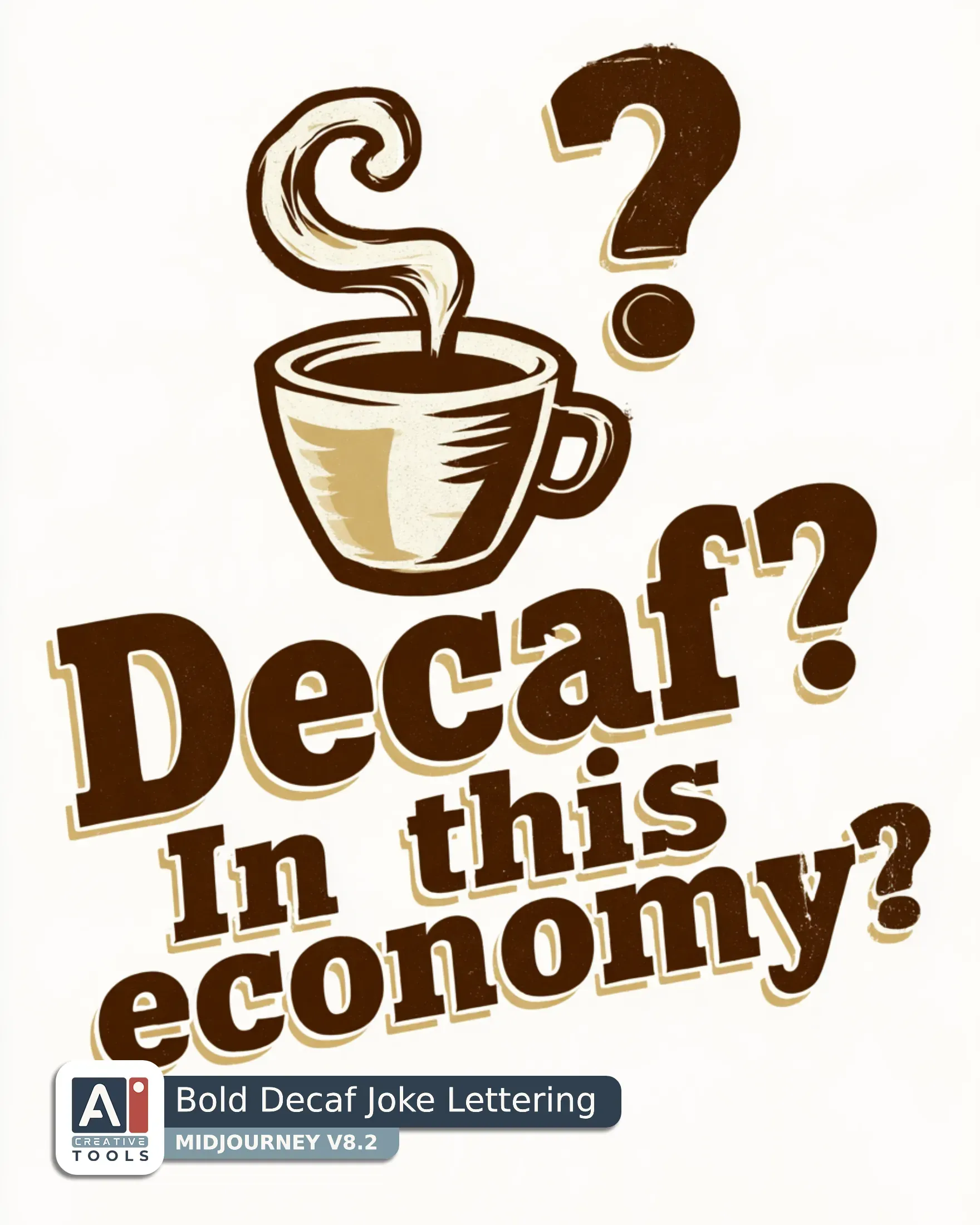
- Bold Decaf Joke Lettering (Midjourney) Graphic design and text with a sarcastic espresso cup in a bold silkscreen illustration, tiny and sharp-edged with a little handle and a curl of steam rising into a question mark. The cup carries a dry, unimpressed attitude, its steam doing the talking. The lettering reads "Decaf? In this economy?" in large, clear retro sans serif letters, set close beneath the cup in one compact unit. Use a limited palette of espresso brown, cream, and muted gold, with espresso brown for the cup and outlines, cream for the body and steam highlights, and muted gold for the accent details and lettering glow. Keep the forms simple and readable with thick clean linework, flat fills, and slight distressed texture for a vintage silkscreen feel. The whole design sits alone on a solid white field with generous white space all around and clear white beneath the lowest point, complete and floating cleanly within the image. --ar 4:5 --v 8.2
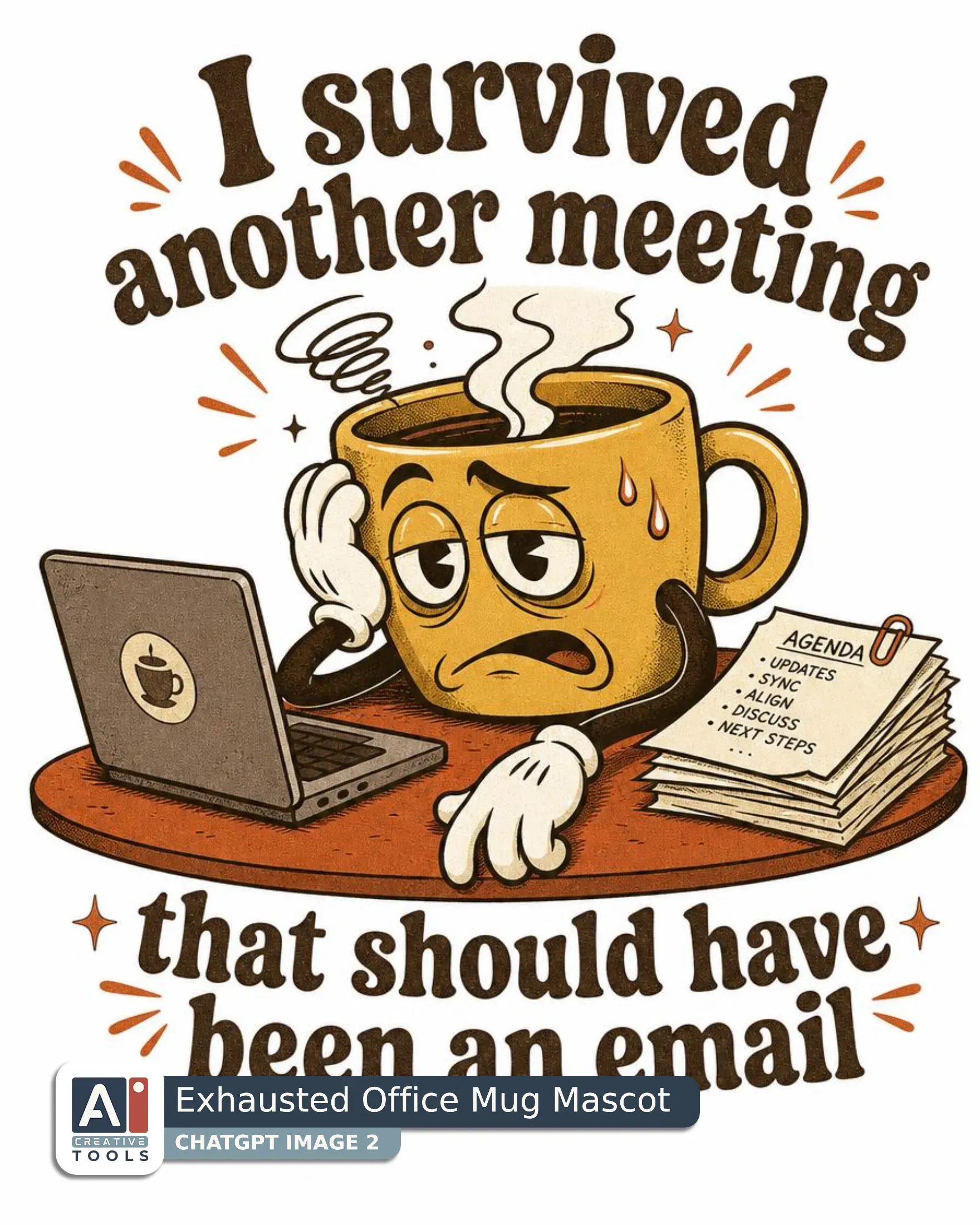
- Exhausted Office Mug Mascot (ChatGPT) Create a graphic design of a frazzled retro cartoon coffee mug with noodle arms slumped over a conference table, with a laptop open beside it and a tiny stack of papers pressed close into the scene. The mug has a weary, sarcastic expression in 1930s rubber hose cartoon, bendy noodle limbs, pie-cut eyes, white gloves, film grain, with bold clean linework, simple vintage shading, and a slightly rough old-animation texture. Use mustard yellow for the mug and warm accents, burnt orange for the tabletop and tired details, brown for outlines and shadows, and cream for highlights and the open white space around the design. The whole scene stays compact and centered with a neat lower edge and clear white beneath it on all sides. Set the lettering in retro groovy type, large and evenly spaced, with the first line above the artwork reading "I survived another meeting" and the second line below it reading "that should have been an email". Keep the words close to the illustration so the phrase and the exhausted office joke feel like one unified badge of complaint.
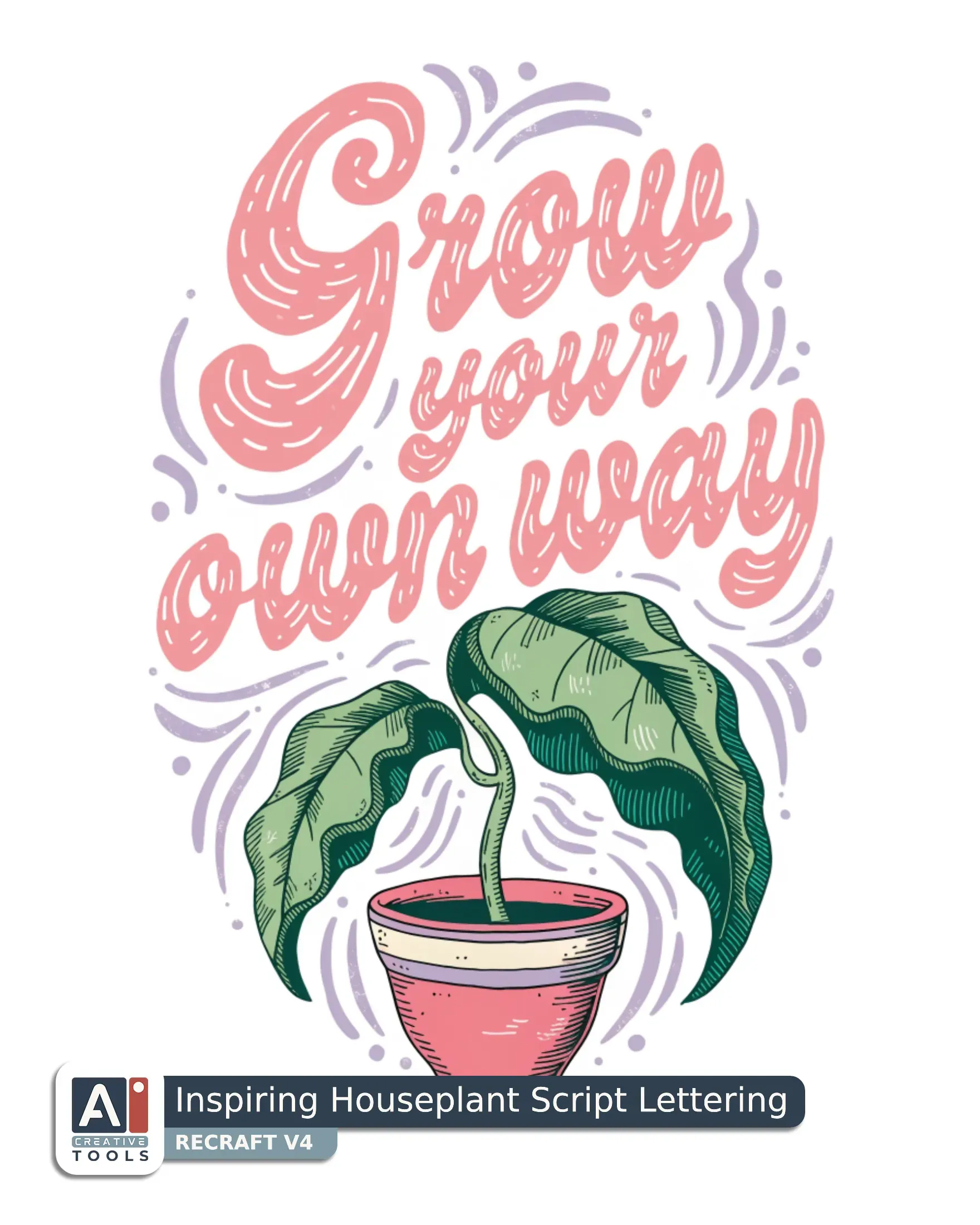
- Inspiring Houseplant Script Lettering (Recraft) Graphic design with the words "Grow your own way" above a sprouting seedling in a small pot, built as a compact, uplifting botanical illustration with a fresh, self-made spirit. Set the lettering large, clear, and evenly spaced in a friendly hand-drawn script that feels encouraging, and let it sit close over the plant so the words and image read as one message. The seedling rises with a tender curve from the little pot, its first leaves reaching upward with quiet determination. Use blush pink for the lettering and the pot’s soft accents, lilac for subtle shadows and tiny decorative touches, leaf green for the stem and leaves, and cream to lighten the highlights and keep the whole mark airy. Keep the linework crisp and confident with gentle rounded forms. Add soft shaded modeling and a lightly textured finish that gives it a screen-printed feel. Place the entire design on a solid white field with generous white space all around and a clear band of white beneath the artwork.
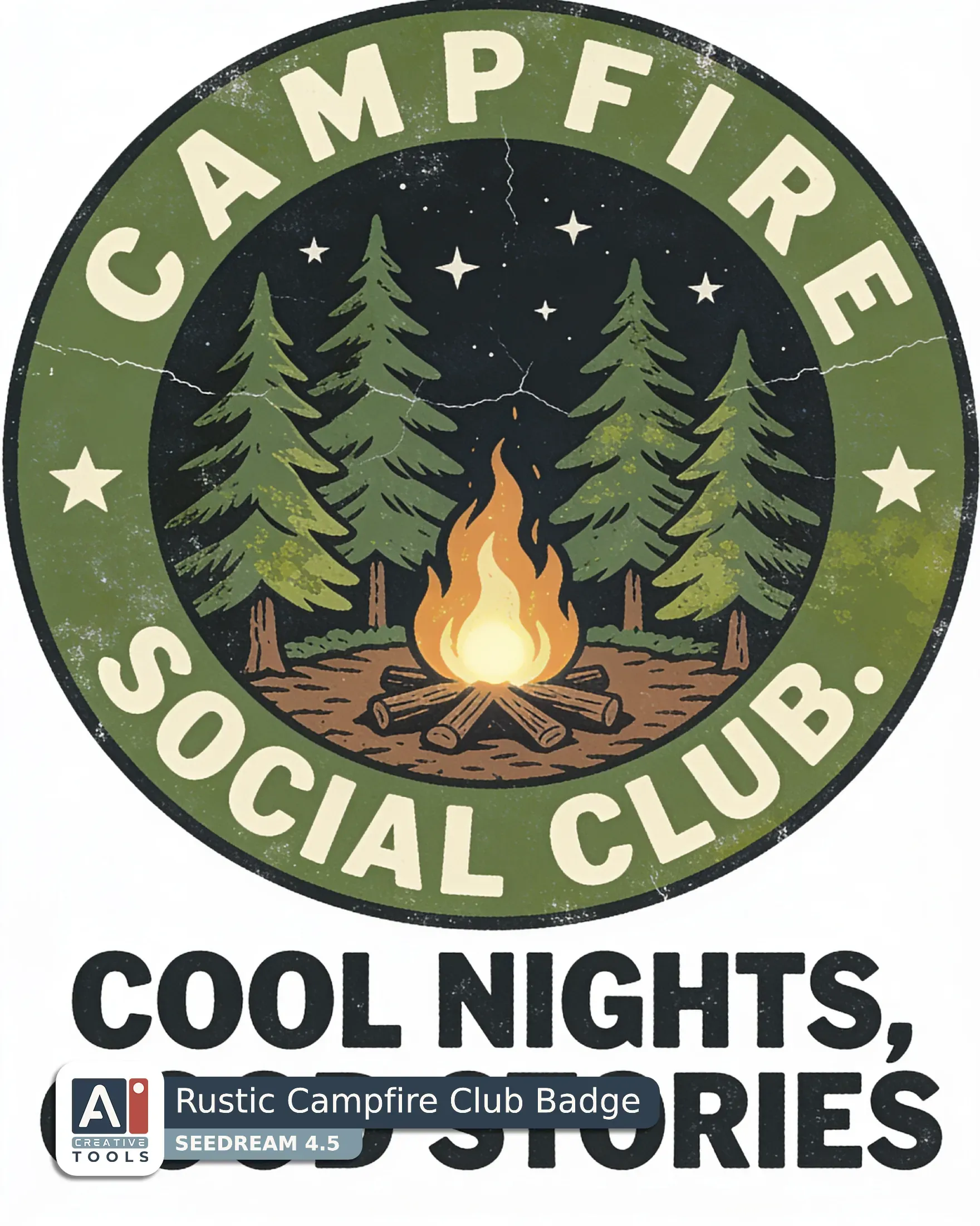
- Rustic Campfire Club Badge (Seedream) Graphic design with vintage 1970s screen print, faded inks, misaligned print layers, worn cracked texture. A circular badge holds tall pine trees around a glowing campfire under a starry night sky, with a calm, easygoing camp mood for hikers. Slab serif lettering wraps the circle in clear, even spacing, with "CAMPFIRE SOCIAL CLUB." on the upper arc and "COOL NIGHTS, GOOD STORIES" on the lower arc, all large and readable at a glance. Forest green fills the pines and outer badge shapes, moss green shades the trees and night layers, bark brown grounds the trunks and firewood, and cream lights the flames, stars, and lettering. Keep the forms bold and compact with rough silkscreen edges, soft distressed shading, and cracked ink texture. The complete badge sits centered on a solid white field with generous white space all around and white below it.
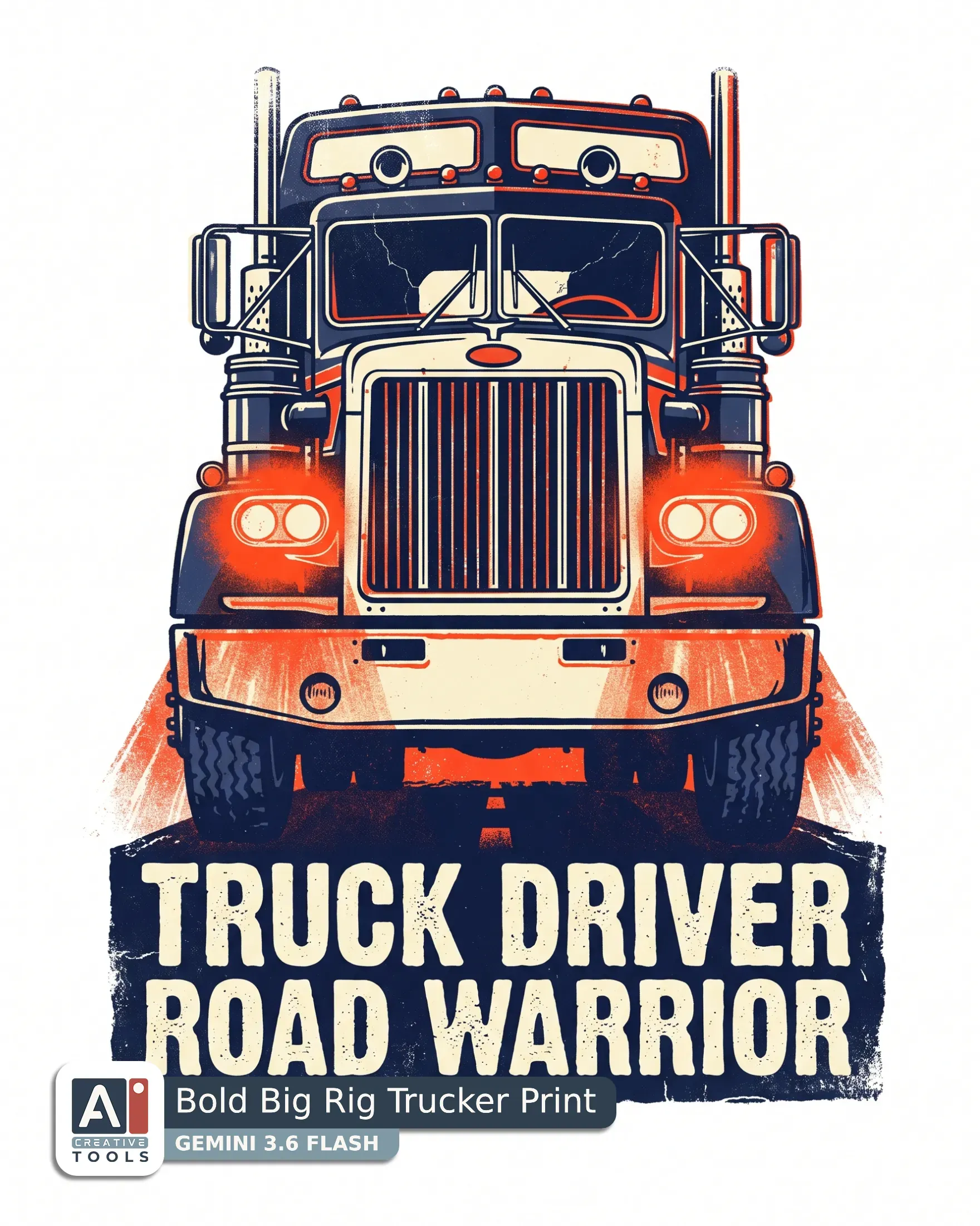
- Bold Big Rig Trucker Print (Gemini) Create a graphic design and text of the front of a big-rig truck with glowing headlights, built as a bold vintage 1970s screen print with faded inks, misaligned print layers, and a worn cracked texture. The truck should feel heavy, confident, and road-tested, with a strong grille, broad hood, and bright lamps that cast a simple glow forward. Keep the silhouette compact and powerful, with the cab facing front and the lighting giving the whole piece an energetic night-highway attitude. Place the words close with the artwork so the image reads as one unit. Set "Truck driver." in large clear block lettering beneath the truck, and set "Road warrior." just below it in the same style, evenly spaced and easy to read at a glance. Use navy for the truck body and shadow shapes, red for accents and the glowing details, and cream for the lettering and highlights. Let the screen print finish show in rough edges, soft ink wear, and visible layer misregistration that gives the whole piece an authentic vintage feel. The design sits alone on a solid white field with generous white space around it and clear white below the lowest point. Aspect ratio 4:5.
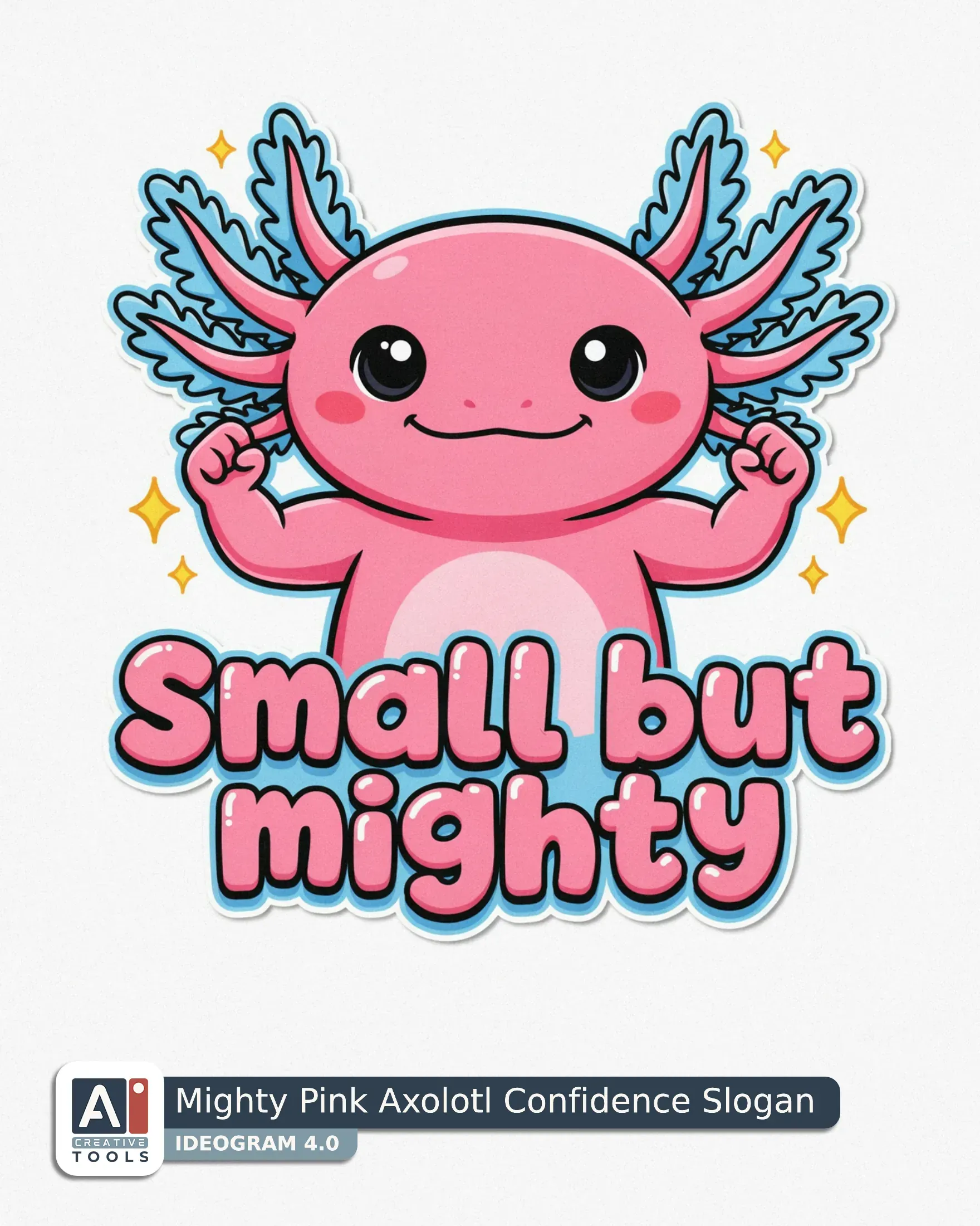
- Mighty Pink Axolotl Confidence Slogan (Ideogram) Graphic design with the lettering "Small but mighty" in playful bubble lettering below the artwork, large, clear, and evenly spaced. Above it sits a cute kawaii style pink axolotl flexing its tiny arms, with round chubby shapes, big shiny eyes, and blush cheeks, posed like a proud little champion. The silhouette is bold and simple so the tiny limbs and smiling face read instantly. Use bubblegum pink for the axolotl body, sky blue for the frilly gills and accent shadows, lemon yellow for small highlights and sparkles, and white for the eye shine, belly accents, and letter highlights. Keep the whole design centered and large, filling about 85 to 90 percent of the image with a thin even margin of white on all sides and white space below the artwork as well. Use soft thick outlines, clean vector linework, and smooth gentle shading with a polished finish. The words sit close beneath the axolotl as one cheerful unit, with the creature’s confident pose carrying the cute energy.
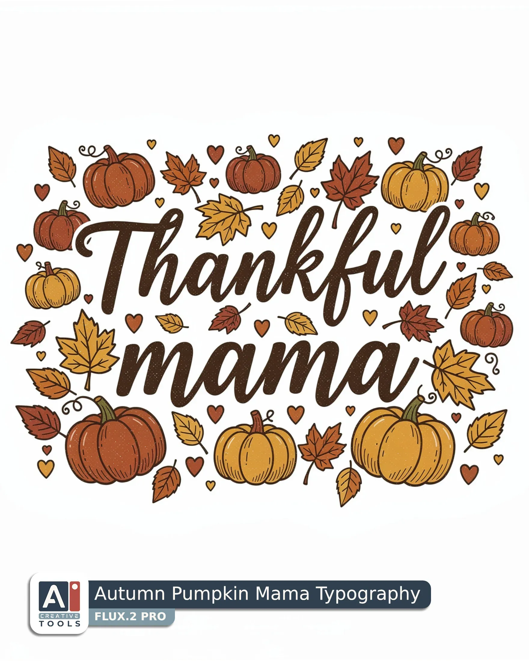
- Autumn Pumpkin Mama Typography (Flux) Typographic design with small decorative elements, vintage hand-drawn illustration of "Thankful mama" in flowing script, set in two straight lines with "Thankful" above "mama", large, clear and evenly spaced. Small pumpkins, autumn leaves and hearts gather around the words in a warm festive cluster, giving the lettering a sweet family-centered feel. Rust, pumpkin orange, mustard yellow and dark brown fill the pumpkins, leaves, hearts and lettering accents with rich seasonal contrast. Use bold clean linework, gentle shaded fills and a lightly textured finish that feels lively and handmade. The composition sits alone on a solid white field with generous white space all around and clear white beneath the design.
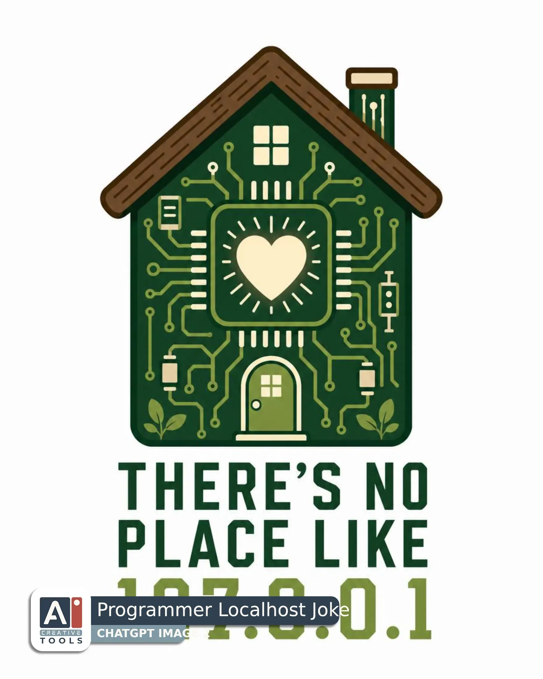
- Programmer Localhost Joke (ChatGPT) Create a graphic design of a microchip shaped like a small house, with a warm heart glowing at its center and clean circuit details that give it a welcoming, tech-savvy feel. Use flat vector illustration, solid flat colour shapes, no gradients, crisp clean edges, with bold simple forms and a polished screen-printed finish. Keep the house-chip compact and clearly readable, sitting alone on a solid white background with generous white space all around and clear white beneath the design. Shape the body in forest green and moss green, with bark brown for the rooflike edges and cream for the highlights, inner glow, and tiny technical accents. Set the condensed lettering below the artwork as large, clear, evenly spaced text in stacked lines, with the words close to the subject as one cohesive unit. The lines should read "There's no" "place like" "127.0.0.1" in a neat block. Give the lettering crisp geometry that suits the art style, with strong legibility and balanced spacing. Use clean linework, restrained shading, and a friendly centered composition that feels heartfelt and clever. Aspect ratio 4:5
AI tools - what we tested, and our current pick
The Helper gives you a prompt, and the design itself comes from the generator you choose. We tested t-shirt design prompts on the following AI tools: ChatGPT Image 2, Gemini 3.6 Flash, Grok Imagine 2, Midjourney v 8, 8.1 and 8.2, Ideogram 4.0, Flux.2 Pro, Seedream 4.5, and Recraft V4.

ChatGPT
Grok

Gemini

Midjourney

Ideogram

Flux
Recraft

Seedream
ChatGPT is our top pick for t-shirt designs today: no other tool handles fonts as well or works the text into the artwork so naturally, and Grok follows close behind with Gemini in third. The other five didn’t show enough t-shirt design skill in our tests, so we don’t recommend them for this niche. Every tool gets a full write-up in our What AI Tool to Pick for T-Shirt Designs guide.
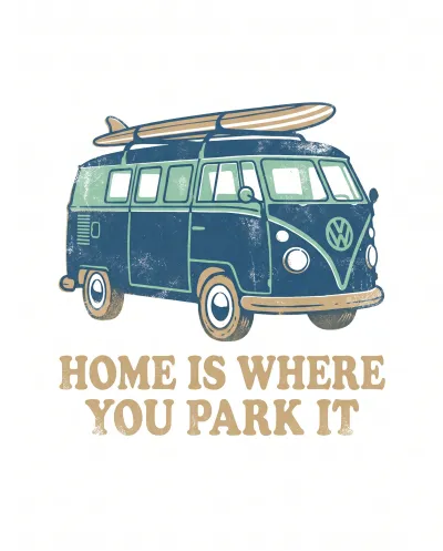
Gemini
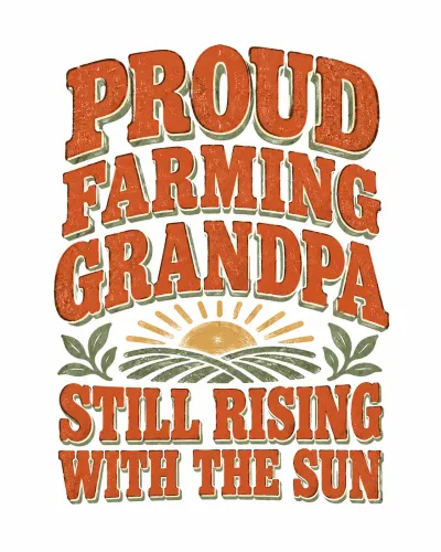
ChatGPT
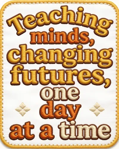
Seedream
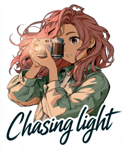
Midjourney
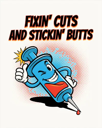
Ideogram
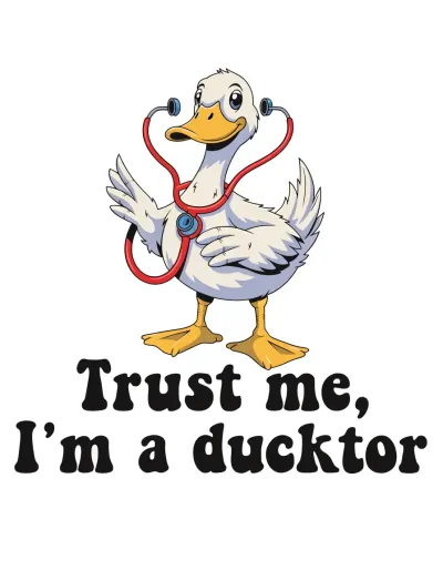
Recraft
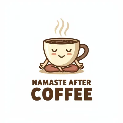
Flux
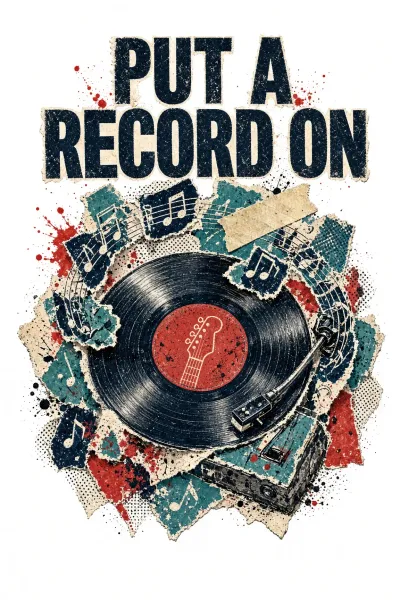
Grok
How the Helper works
First, two things that set the Helper apart from our Builders.
The Helper is an HTML file - this time we went beyond Google Sheets. The new format finally let us leave Google's limitations behind. That means a much nicer interface, with dark and light themes, and you can even use the Helper on your phone.
All it needs is a browser and an internet connection. The connection matters: the AI that suggests ideas and writes your prompt works through our server, and the Helper reaches it online. That AI help along the way is the whole point of the tool.
An HTML file doesn't save your picks between sessions. Each time you open it, you start fresh, so plan to finish your design in one go. The Helper does remember your AI tool and its parameters, and it keeps every prompt you make in the Prompt Log - more on both in Step 3.
The Welcome Screen
The Helper's welcome screen
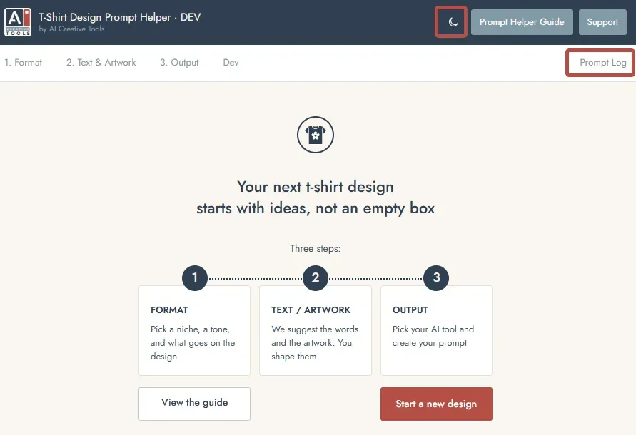
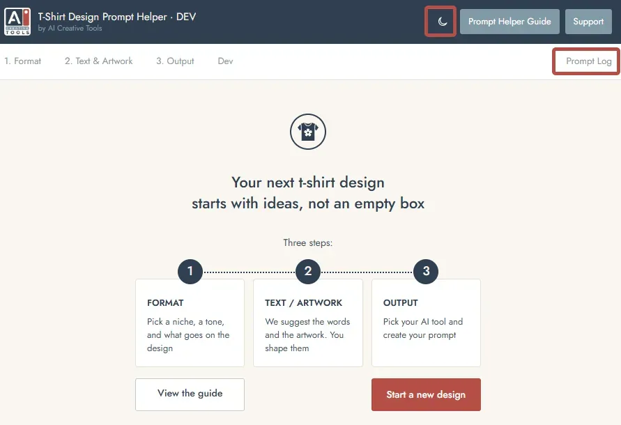
The welcome screen shows the three steps ahead: Format, Text & Artwork, and Output. The "View the Guide" button, here and at the top of every screen, brings you back to this page, the most detailed and up-to-date version of the guide. Also you can see the Theme switcher in the top right corner and the Prompt Log link, which will appear as soon as you create your first prompt.
And now press "Start a new design" to begin.
Step 1 - Format
Step 1 - Format
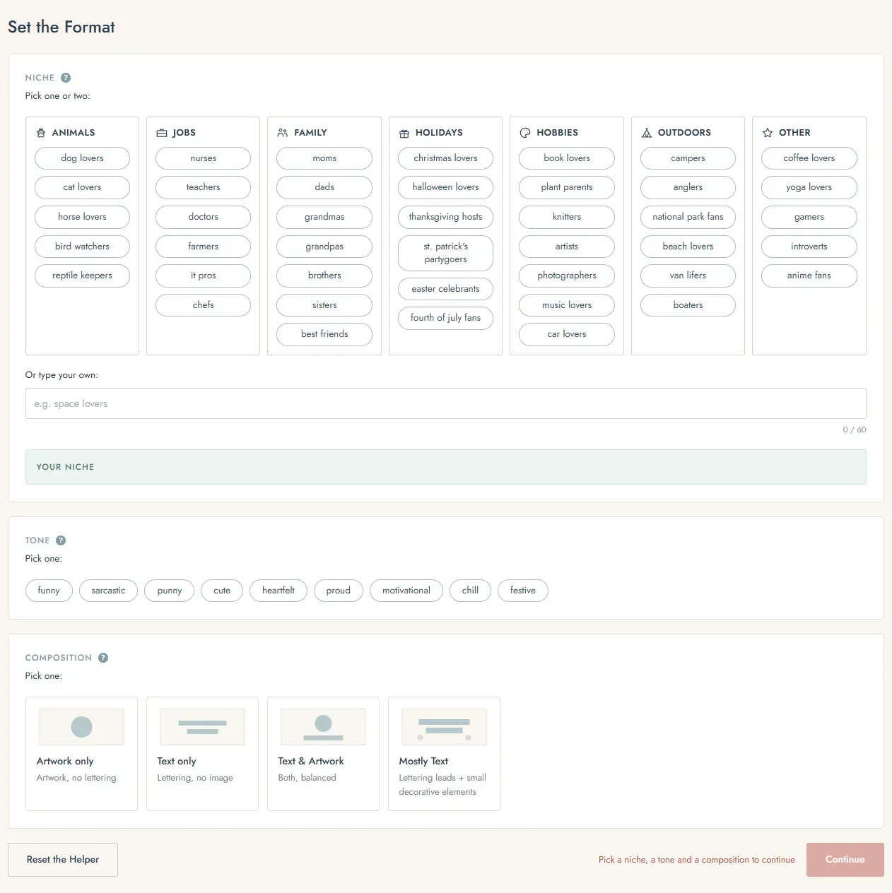
Three picks shape everything that follows: niche, tone, and composition.
Niche is who the design is for. There are over 40 niches: pick one, or two for a cross-niche design like coffee and book lovers. Your niche isn't on the list? Write your own - anything in this custom field overrides the options above it. No need to remember that rule: the "Your niche" field always shows exactly what goes into the prompt.
Also the Niche section has a question mark right beside its name. You'll see these question marks all over the Helper. Hover over one to get a detailed explanation.
Tone sets the mood of both the text and the artwork - funny, sarcastic, punny, cute, heartfelt, proud, motivational, chill, or festive.
Composition decides what goes on the shirt:
- Artwork only
- Text only
- Text & artwork
- Text with small decorative elements
A quick note on terms, since they come up all through the Helper: "design" is the whole piece, "text" is the typography, and "artwork" is the imagery.
All three picks are required. If one is missing, the reminder next to the Continue button tells you.
Step 2 - Text & Artwork
This is the main step, with two sections: Text & Artwork, and The Look. With a text only or artwork only composition, you'll just see the matching block.
Step 2 - Text & Artwork
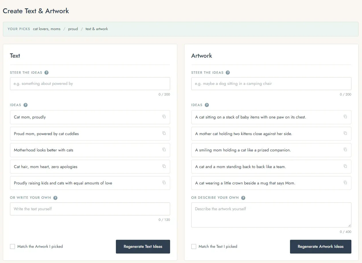
In the Text & Artwork block, the first AI ideas arrive based on your Step 1 picks. If a quote and an artwork idea click right away, pick them and move on. Most of the time you'll want to refine them a bit, and there are three ways to do it:
- Regenerate gives you five new ideas. Anything you picked stays pinned.
- Steer the ideas: type a direction, like "something about powered by", then regenerate. All the new ideas follow it.
- Describe your own: write your own from scratch, or copy an idea that's almost right and finish it yourself. This field overrides your pick.
The artwork block works exactly like the text block. Each block also has a matching checkbox: "Match the artwork I picked" in the text block, and "Match the text I picked" in the artwork block.
Step 2 - The Look
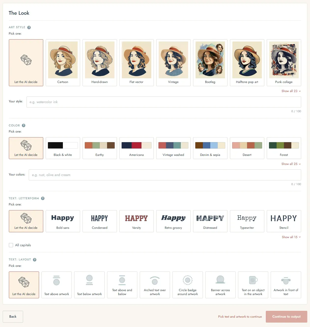
The Look has four blocks: Art Style, Colors, Letterform and Layout. Letterform and Layout only appear when your design has text. Each block opens on "Let the AI decide". Leave it that way and the AI chooses from the options in that block - it won't invent new ones.
Art Style comes with a wide range of styles, each with a thumbnail - from Vintage and Kawaii to Embroidered patch and Pixel art. The description of the style you pick appears in the "Your style" field, where you can use it as it is, tweak it, or describe a completely new style. No more strict style limits.
Colors work the same way. Pick a palette, then edit it in "Your colors" or build your own.
Letterform holds popular choices like Retro Groovy and Varsity, and Layout sets how the text and artwork sit relative to each other. The layout options change depending on your composition.
Step 3 - Output
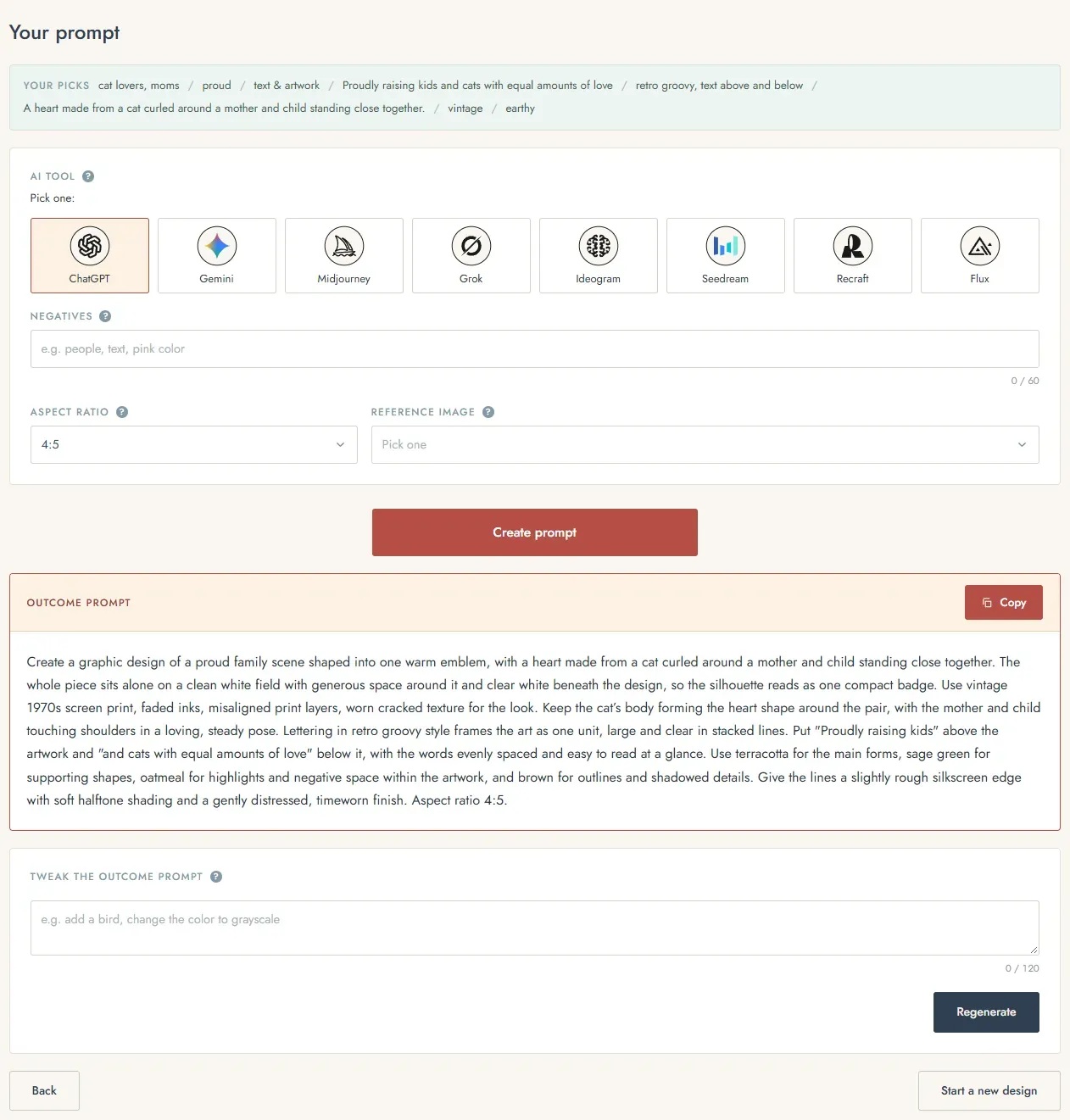
Step 3 - Output
The Output step opens with a summary of all your picks from Steps 1 and 2. If something's wrong, now is the time to go back and fix it.
Pick your AI tool. The Helper remembers it, so next time it's already selected. Negatives are optional - they're the things you don't want to see on your design.
The rest depends on the tool:
- Gemini and ChatGPT: aspect ratio, plus a reference image dropdown that tells the AI how to treat an image you attach if you attach one. 4:5 is the most popular ratio for t-shirts.
- Midjourney: aspect ratio, version and stylize, plus "Your parameters", which overrides the other parameter picks if they conflict.
- Every other tool: negatives only.
Your parameter picks are saved between sessions as well.
Create the prompt, copy it, and run it in your AI tool. Want to change something? Type it into "Tweak the outcome prompt" and regenerate. In this example we turned a cat theme into a dog theme this way, and the tweak worked perfectly.
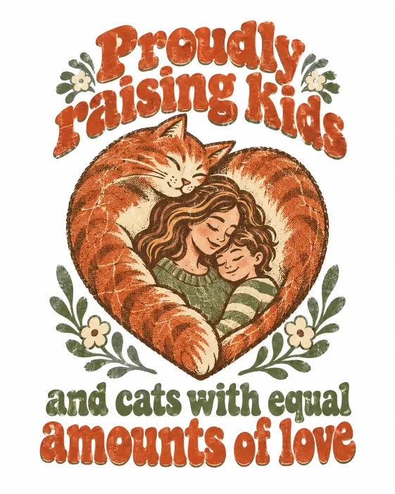
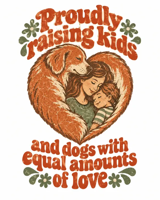
Every prompt you create or tweak is saved to the Prompt Log, and it stays there between sessions. The log appears in the header menu, top right, as soon as your first prompt is ready. It holds finished prompts only - the text and artwork ideas aren't logged.
Getting good t-shirt design results
- Finish one part first, text or artwork, and then move to the other. We usually start with the text: quotes are shorter than artwork descriptions, so they're quicker to work with. And in many cases you already have a ready quote on your mind.
- The first ideas come only from your niche, tone and composition, so the artwork probably won't match your carefully prepared quote. Once the text is ready, tick "Match the text I picked" in the artwork block and regenerate the artwork ideas. Started with the artwork instead? The text block has the same checkbox the other way round - "Match the artwork I picked".
- Choose the letterform with your AI tool in mind. If it handles t-shirt designs really well, any letterform will do. If it's more average, skip plain options like Bold Sans or Condensed, because they can look too ordinary. A t-shirt needs a bit of character.
- Treat the Look as a direction, not an exact result. The thumbnails, palettes, letterforms and layouts show where the design is heading, and every AI tool interprets them in its own way.
- Small change, small fix. If the result is almost right, use "Tweak the outcome prompt" instead of starting over.
- The recipe for a good t-shirt design is simple: speak to a clear group of people, say something they'd love to wear, and pick artwork that supports the message. A few examples made with the Helper:
- Dog moms, funny: "Powered by coffee and dog hair", vintage style
- Book lovers, cute: "Just one more chapter" with a sleepy cat, retro groovy letters
- Teachers, sarcastic: "I teach. What's your superpower?" in varsity letters
Ready for more? What AI Tool to Pick for T-Shirt Designs weighs every tool for this kind of work. Once your design is ready, the Mockup Prompt Builder gives you a blank product photo.
Happy creating
That's the T-Shirt Design Prompt Helper. Pick your niche and tone, shape the words and the artwork with the AI, bring the generator you like, and start designing. We hope it makes the hardest part, the idea, a lot easier, and helps you create shirts people would really want to wear.
Every image in this guide came from prompts built with the T-Shirt Design Prompt Helper.