Welcome, digital artists!
In this guide, we’re going to talk about style in Midjourney. I still think that this AI is the most versatile in terms of style, giving you not only the widest variety on the market but also a bunch of tools to manage styles. You will learn 3 approaches:
- Text: how to describe your style in a prompt
- Style Reference: how to find and utilize ready-to-use styles
- Moodboards: how to create your own style
All of these approaches allow for a certain level of style consistency, and combining your knowledge from all of them will provide the best outcomes in terms of style control as well as consistency. An important disclaimer here: in this guide, we’ll focus only on illustrations, not photos. You can use the same style tricks for photos as well, but photos have even more nuances to cover, which we’ll certainly dive into in another guide.
Video guide “Master Midjourney Styles: Prompting, SREF Codes, Moodboards & Style Consistency”
TEXT: Style Prompting Tips
The first level of style control lies in your prompt. Here are some examples of popular terms that can be used as style guidance for AI: watercolor, 3D, paper cutout, vector, outlined, pixel art, and so on.
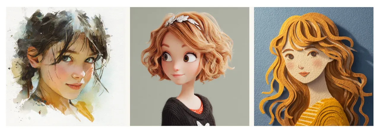
Prompt: Portrait of a charming young girl, {watercolor, 3D, paper cutout} style --v 7.0
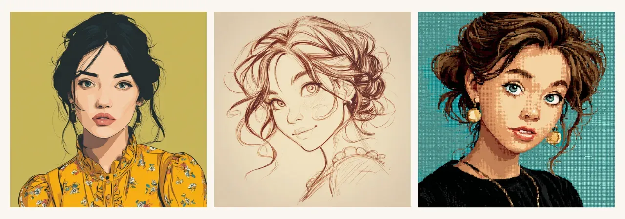
Prompt: Portrait of a charming young girl, {vector, outlined, pixel art} style --v 7.0


Now let’s get into more detail. When you describe the style in words, there are actually several layers of style, and you might want to combine some of them to have more control over the result.
Here’s how I classify these layers:
- technique (watercolor, oil painting, ink drawing, etc.)

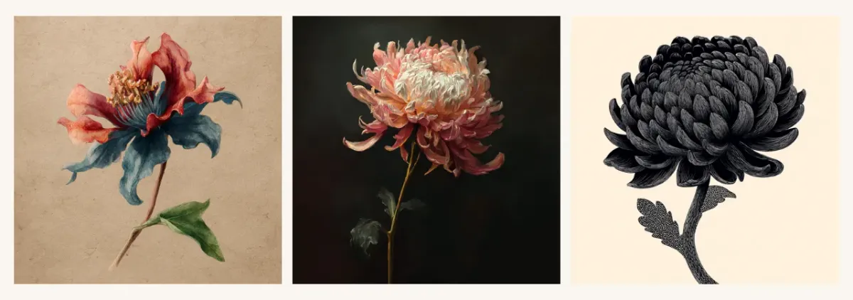
Prompt: A mysterious flower, {watercolor, oil, painted, ink drawn} style --v 7.0
- aesthetics (boho, gothic, fantasy, etc.)
Prompt: A mysterious flower, with {boho, gothic, fantasy} aesthetics --v 7.0
- art type (art deco, claymation, Ukiyo-E, etc.)
Prompt: A mysterious flower, {art deco, claymation, Ukiyo-E} style --v 7.0

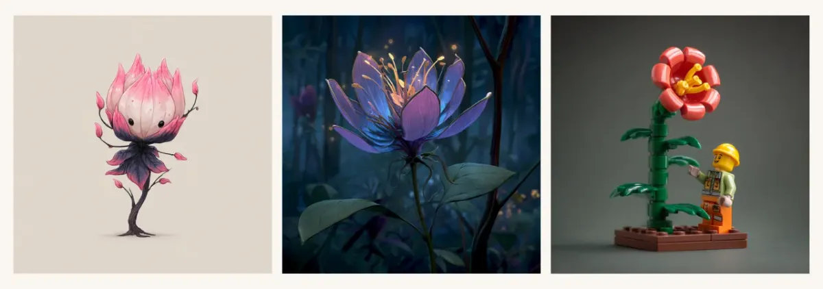
- particular style (Chibi, Disney cartoon, Lego figurine, etc.)

Prompt: A mysterious flower, {Chibi, Disney cartoon, Lego figurine} style --v 7.0
- specifications (with bold outlines, symmetrical, quirky character, etc.)
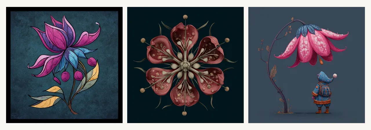
Prompt: A mysterious flower, {with bold outlines, symmetrical, quirky character} --v 7.0

- mood/atmosphere/vibe (romantic mood, spooky vibe, adventurous spirit, etc.)
Prompt: A mysterious flower, {romantic mood, spooky vibe, adventurous spirit} --v 7.0
You can classify these layers in your own way. Don’t be shy about adding several layers and getting more descriptive with your style. The more detail you add, the more personalized and repeatable your style becomes.
Tip: Combine matching styles and avoid putting together contradictory ones. For example:
- Matching style combinations - will help you strengthen your idea:
3D + paper cutout, watercolor + hand drawn, vector + flat + minimalist - Contradictory combinations - AI will most likely pick just one of them:
watercolor + claymation, cartoon + hyperrealistic - Complementary combinations - each layer makes its impact, creating a well-controlled harmonized style:
Watercolor + ink outlined, 3D + Pixar, Kawaii + minimalist + romantic mood
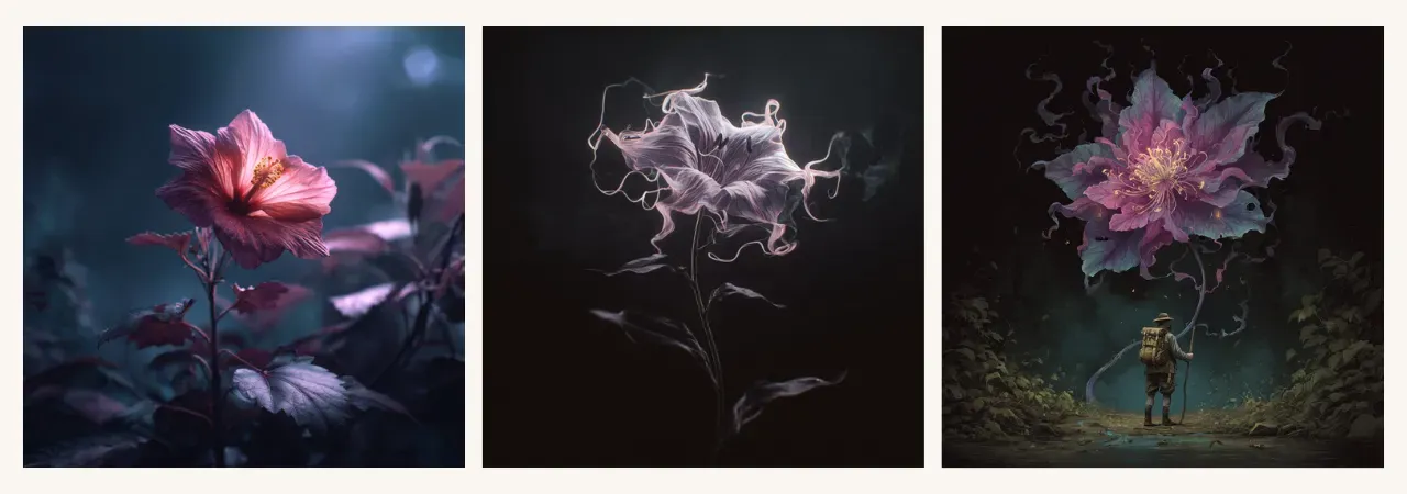
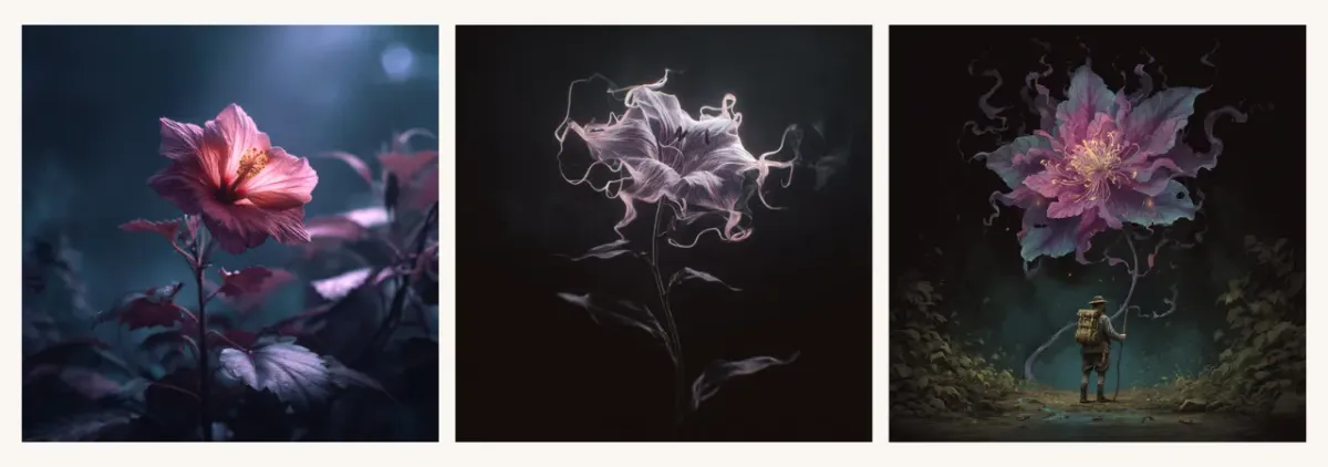
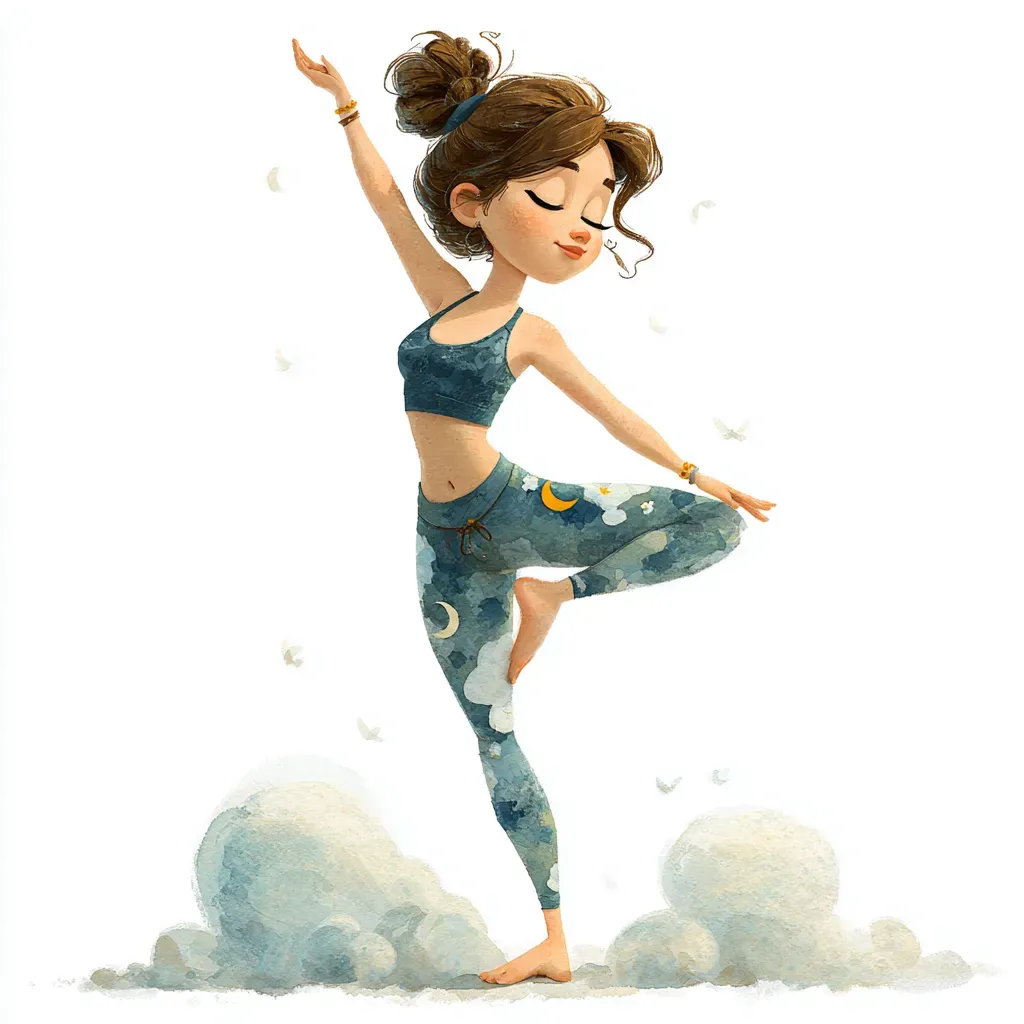
Here’s a good example of 2 contradictory styles in the same prompt:
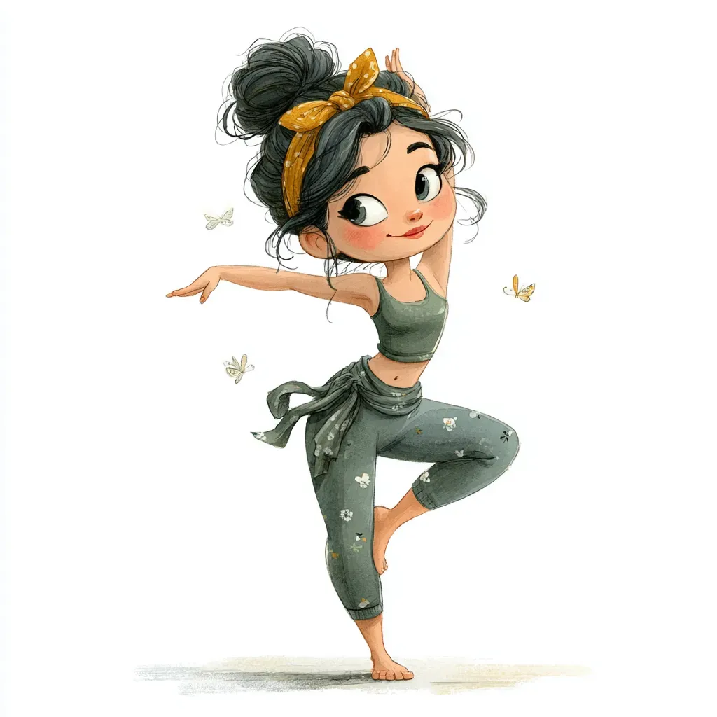
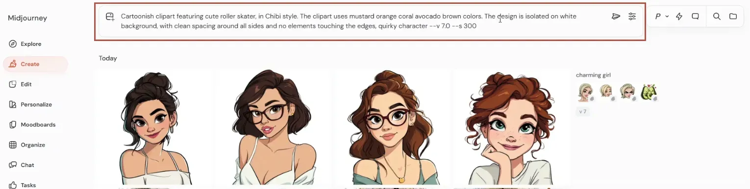
Prompt: Watercolor clipart featuring charming yoga instructor, in claymation style. Charming yoga instructor is stretching, whimsical atmosphere. The clipart uses eco colors. The design is isolated on white background, with clean spacing around all sides and no elements touching the edges --v 7.0 --s 300
Prompt: Claymation clipart featuring charming yoga instructor, in watercolor style. Charming yoga instructor is stretching, whimsical atmosphere. The clipart uses eco colors. The design is isolated on white background, with clean spacing around all sides and no elements touching the edges --v 7.0 --s 300
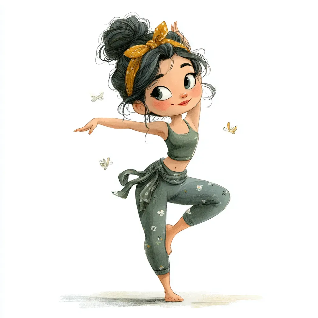

When you choose claymation (it’s 3D objects made of clay) and mix it with watercolor (a flat paper illustration), you won’t get a good result showcasing both. As you see in this example, the AI picked watercolor and skipped claymation completely. Even if you swap the order, watercolor still dominates. The reason is that Midjourney’s training dataset for watercolor is much larger than for claymation.
So, where’s the proper place for style details in your prompt? Usually, it goes at the end, right before parameters:

If your prompt is very long or the AI keeps skipping certain details, move them to the beginning. Remember: the closer a word is to the start, the more likely it is to be depicted - the start of your prompt is prime real estate.

By the way, if you don’t enjoy writing prompts, try one of our Prompt Builders. It’s much easier to craft a prompt by simply picking what you like from pre-filled dropdowns instead of writing everything manually from scratch. As you make selections, you not only build a prompt in seconds but also learn and get inspired. On top of that, the proper prompt structure is already prepared by us and tailored for specific tasks - Clipart, Junk Journal, Wall Art, Photo, Patterns, Coloring Pages, and many more. Perfect for beginners and a time-saver for advanced users.
Where to Get Style Ideas and Inspiration
Now let’s move to inspiration. Mainly we’ll cover style references and moodboards. You can also use the /describe command to re-create an existing image, including its style. Check out our Midjourney Describe guide to learn more.
Style reference in Midjourney is managed by the --sref parameter. After --sref comes a unique number code or a link to the reference image. You can also type --sref random to get a random style outcome.
First, let’s explore the codes. Midjourney has a Style Library on the official site - very handy. Go to the Explore tab, then on the right pick “Styles”. You can browse by random, hot, today’s, this week’s, or this month’s top. You can also “like” a style to save it, and you can search styles by keywords in the top-right corner - it’s a great way to search for styles of certain aesthetics (like anime) or color palettes.

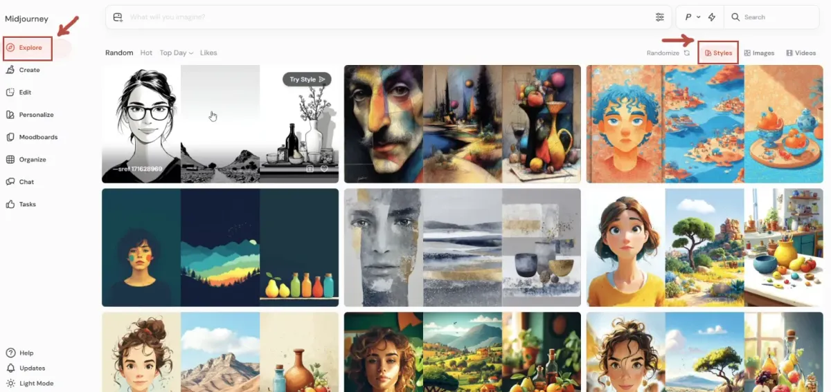
Ok, now let’s see how we use style codes. You can perform the same actions from the default catalogue view as well as from this personalized view of the style - it just has a bit more outcome examples.
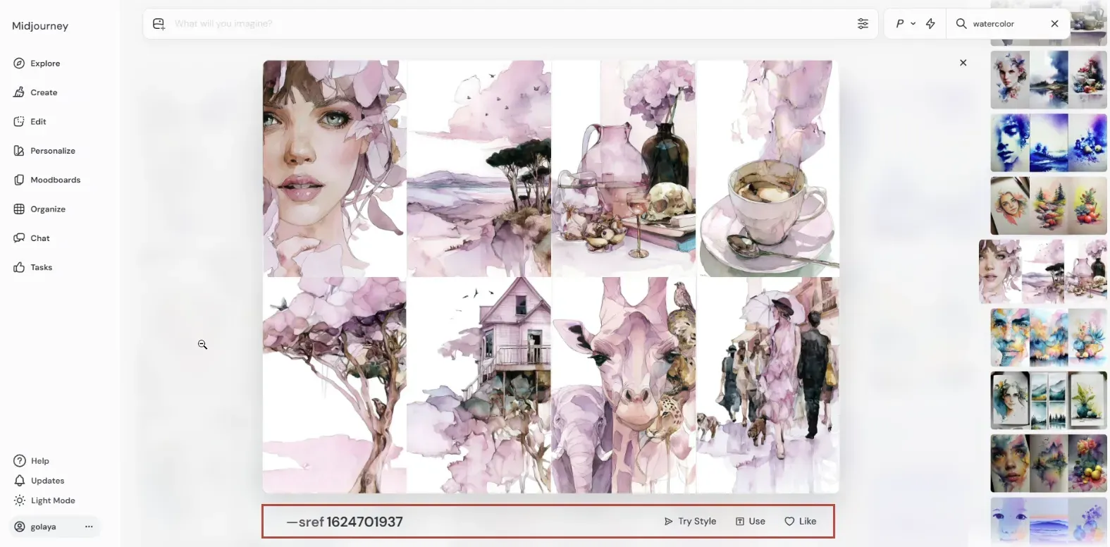

Below the style example image collage, you can see several options: the style code, “Try style”, text icon, and like button. Clicking on the code itself or this text icon (both actually work the same) will add this style code to your prompt field. You can also click “Try style” to run your recent prompt with this style code. There’s also an option to like this style, adding it to your liked styles view. Multiple style codes can be used together, allowing you to mix them.
Moodboards are for your custom styles. You can add images from the web, from a local device, or from your Midjourney creations. Think of a moodboard as training Midjourney to build your personalized style model. In my experience you should have at least 100 cohesive images inside to get good results when using a moodboard.
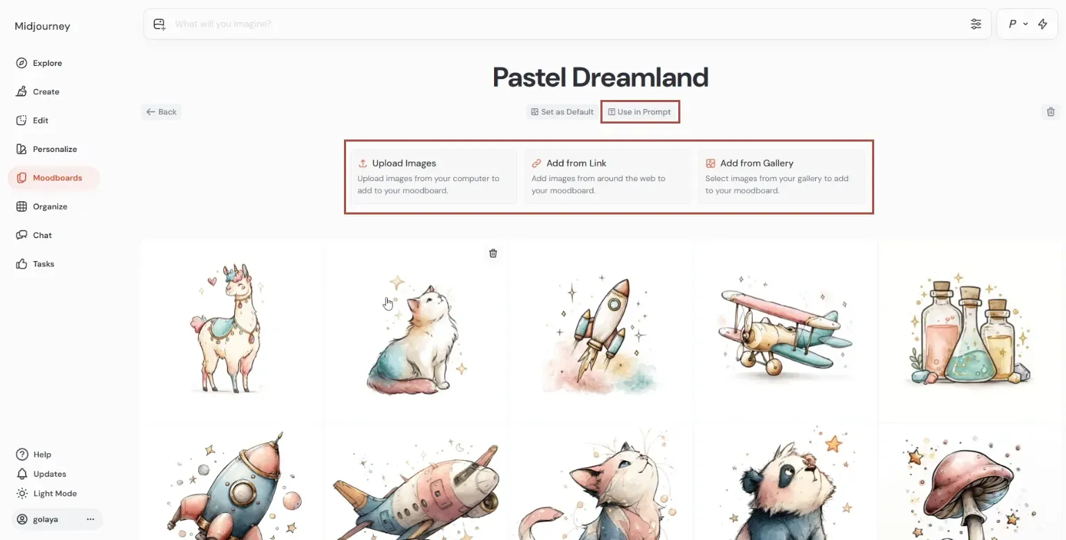
Click the Text icon to use this moodboard in a prompt. Moodboards can be combined with SREF codes, giving even more varied results. Many creators share their moodboards online, but in my opinion, this tool is most powerful when you build your own one since only you know the inspiration behind it.
Style Consistency
Proper prompting, SREF codes, and moodboards already give you some level of consistency, but there’s more. You can also use style reference images.
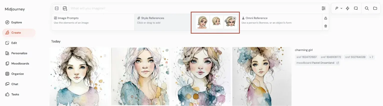
Drag an image onto the prompt field to see this menu. The middle right section is for style reference, you can add several images here. The images can be sourced from your device, your or someone else’s Midjourney creations, or links from the web. To use web images, type --sref manually followed by the link.
My best practice for fast consistency:
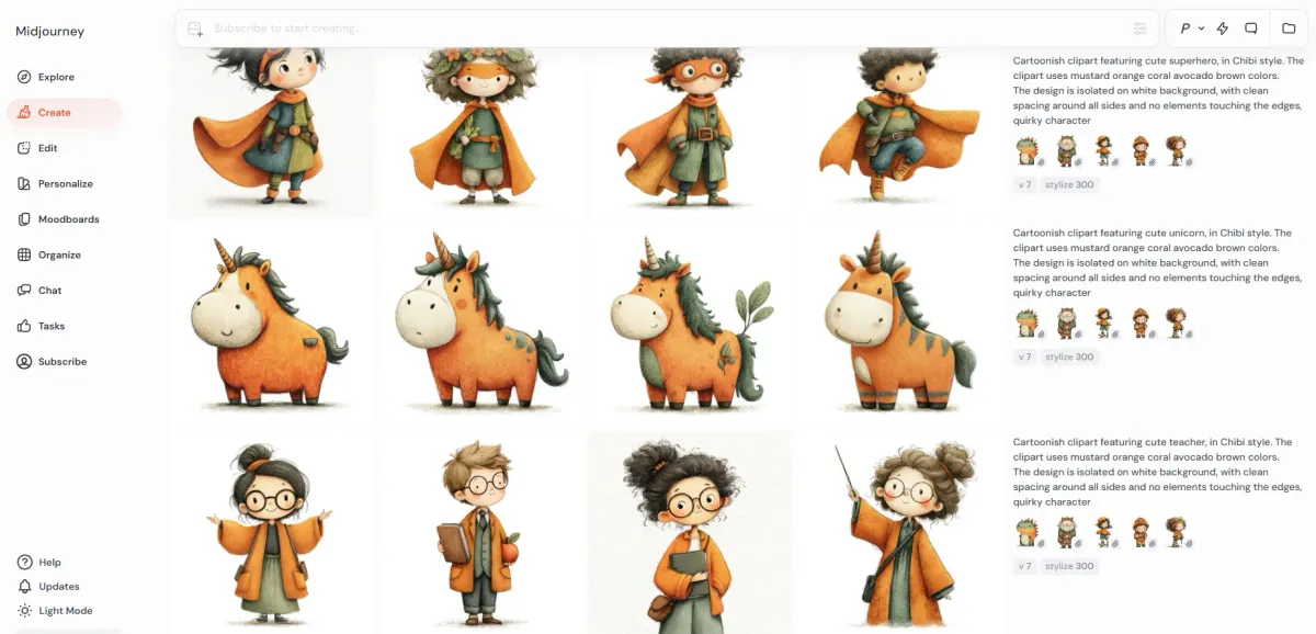
1. Type a prompt with a detailed style description and run it. Once again, to make things easier, I’ve made this prompt with our Clipart Prompt Builder.

2. Use the same basic prompt, changing just the object for your next few prompts.

3. Now you have images with various objects and basic style consistency, and now let’s level it up. Drag several results you like into the style reference field.


4. Keep reusing the same prompt with the same text description of style together with the same style reference images while changing objects. This way, your text description and reference images work together, reinforcing each other. As you can see, these new images have much more style consistency.

Using this method, you can easily create, for example, a clipart collection. If you want to go further, you can use them to build a full moodboard - and that’s totally worth it if you plan to use this style often.
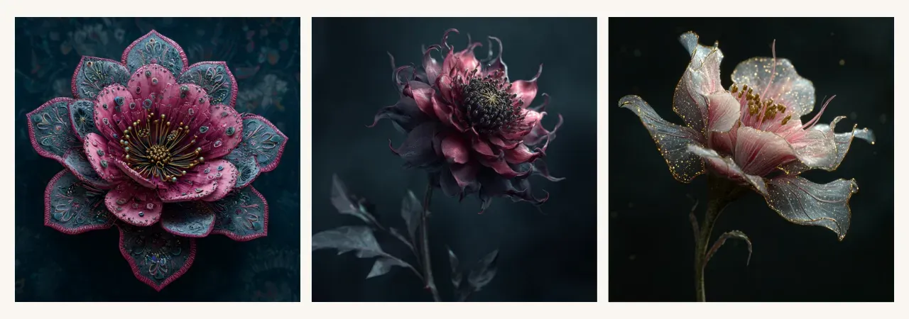
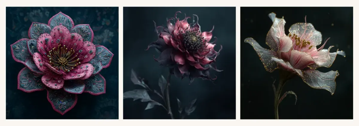
Style weight is the parameter that controls the impact of SREF styles. It ranges from 0 to 1000, with a default value of 100. Add it to your prompt like this: --sw 250. Increasing the value above 100 makes the style reference more impactful, and vice versa.

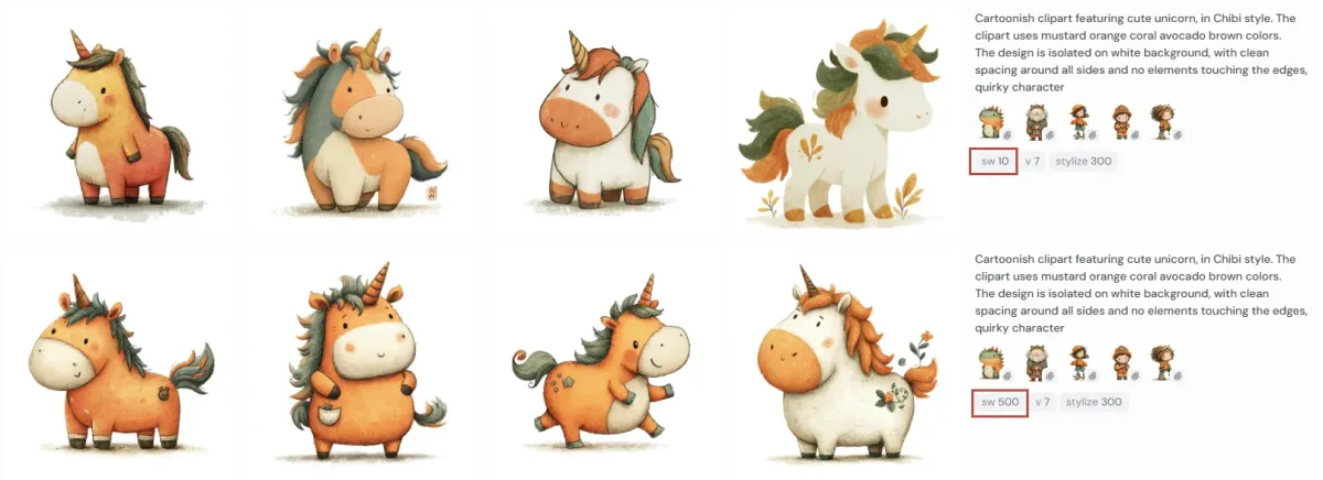
You can see in these examples what difference it makes. In the top row of images with style weight 10, we’ve almost come back to relying just on our text description of style, which couldn’t provide enough consistency. Please keep in mind that style weight works only with the data under the --sref parameter. It doesn’t apply to your text description of the style or moodboards.
Summary
- Midjourney currently offers the widest variety of styles among AI tools.
- Styles can be managed in three main ways: manually via prompt, with --sref codes and reference images, and through moodboards.
- All of these methods can be used to achieve style consistency; combining them leads to stronger consistency.
- You can control the impact of --sref styles with the --sw (style weight) parameter.
- To get more control over the style via your prompt, get descriptive with your styles using several “layers” or complementary terms.
- Avoid mixing contradictory style terms since Midjourney will usually favor one and ignore the other.
Happy creating!